V8
Reigniting The Power of Plants
Wellness is more than an intake of vitamins and nutrients; it's about nourishment that powers your day and leaves you feeling good inside and out. So whether you require fuel to power up, a little boost of energy to keep you going, or a refreshing sip to quench your thirst, the power of plants is here to help you flourish.
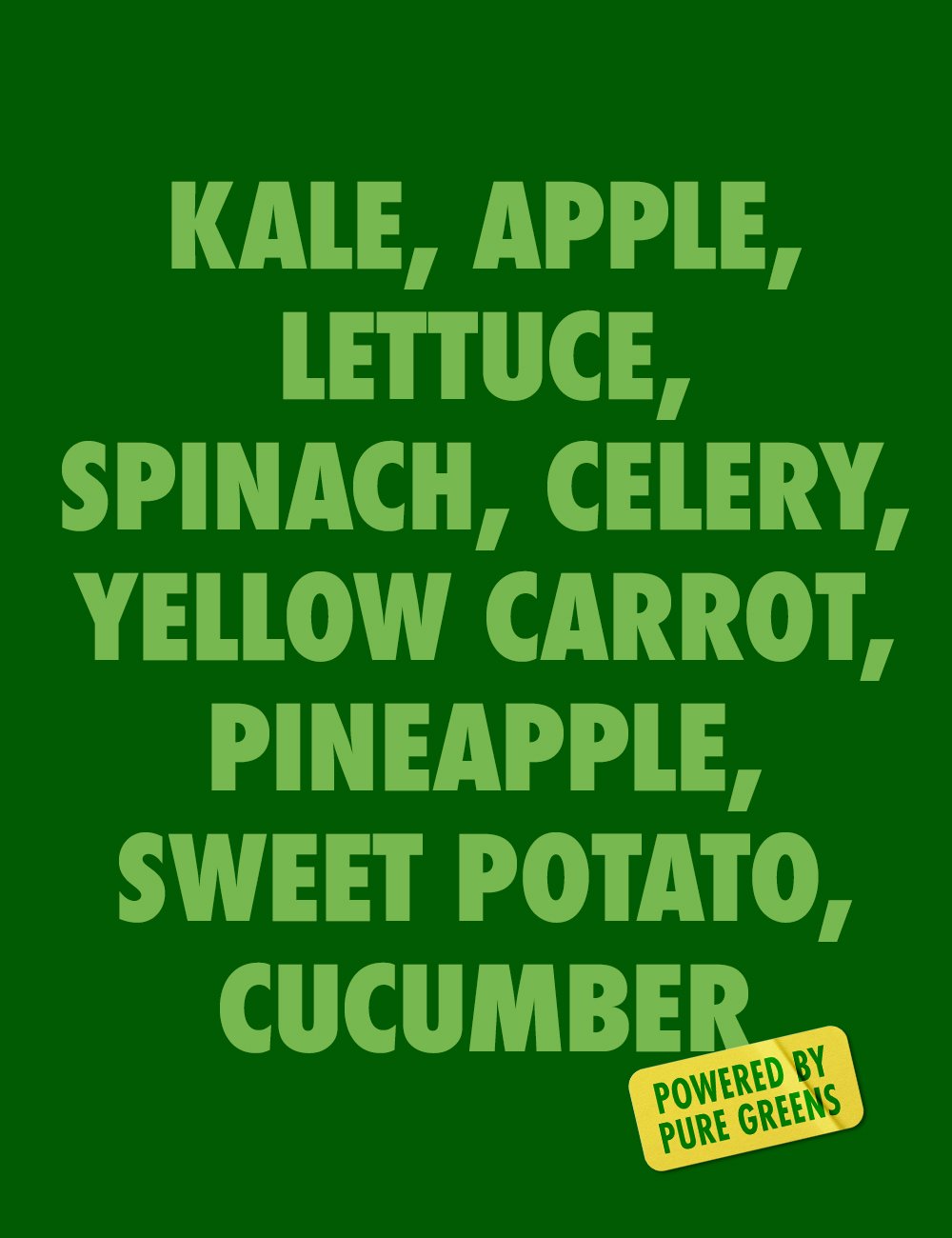
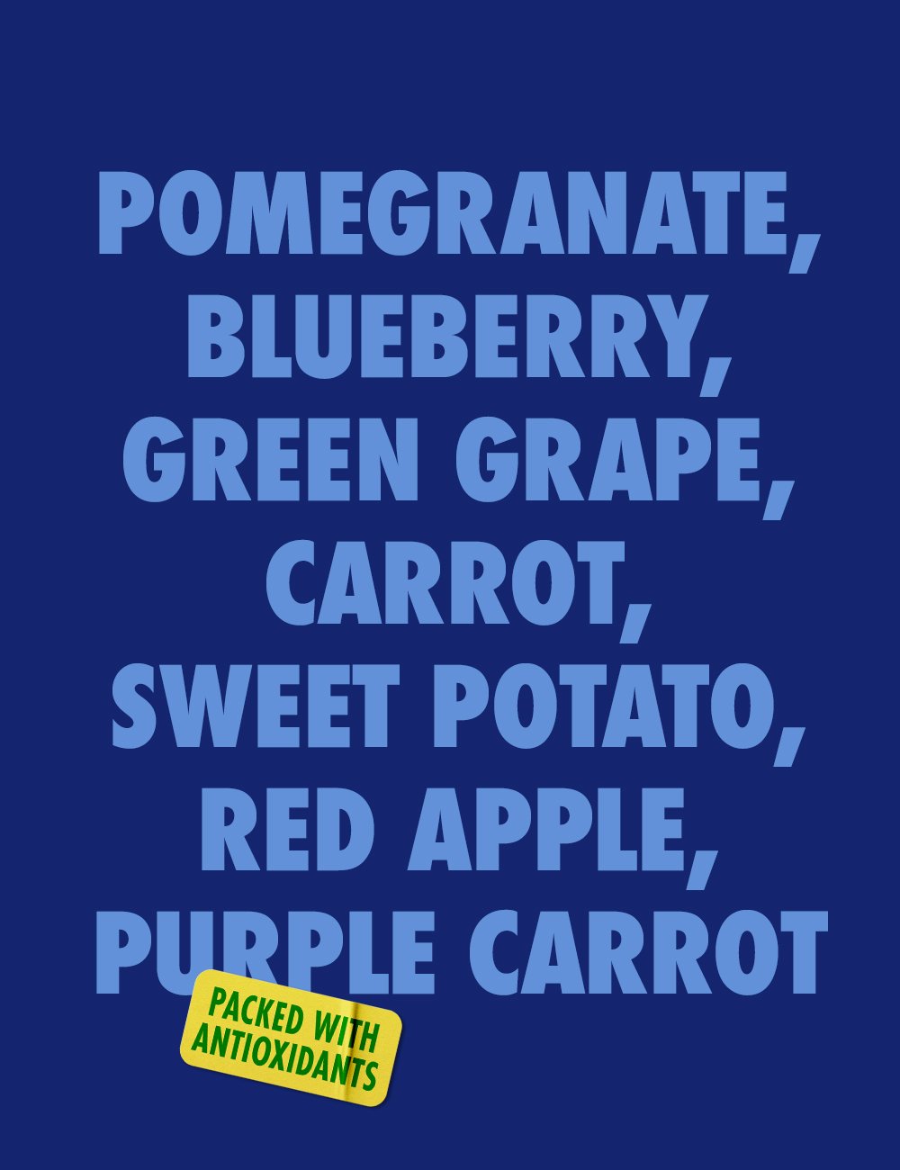
Discover the vibrant energy of nature's goodness within. Through transforming vegetables, fruits, and botanicals into delicious & dynamic blends, V8 unleashes the power of plants.
-
It was no secret that V8 was known as an "old person brand," but with the rapid rise in juice culture, it was primed to deliver all the benefits younger generations are looking for in an affordable and accessible way. Leveraging the heritage and equity of the brand was vital; it would provide credibility in a constantly shifting category that is hard to track. The trick was to find new ways to tap into the classic and vibrant ingredient combinations to bring a sense of dynamic flourishment that would resonate across the brand's entire product portfolio.
Across the brand's product portfolio, a disconnect in visuals, hierarchy, and branding contributed to consumer confusion. This ultimately did a disservice to the brand's innovations throughout the years. The problem was bringing visual consistency across products while boosting the brand health story and unique product attributes that align with current consumer needs.
-
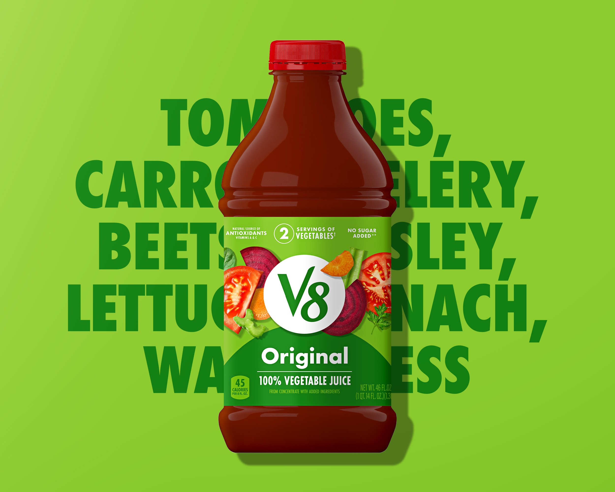
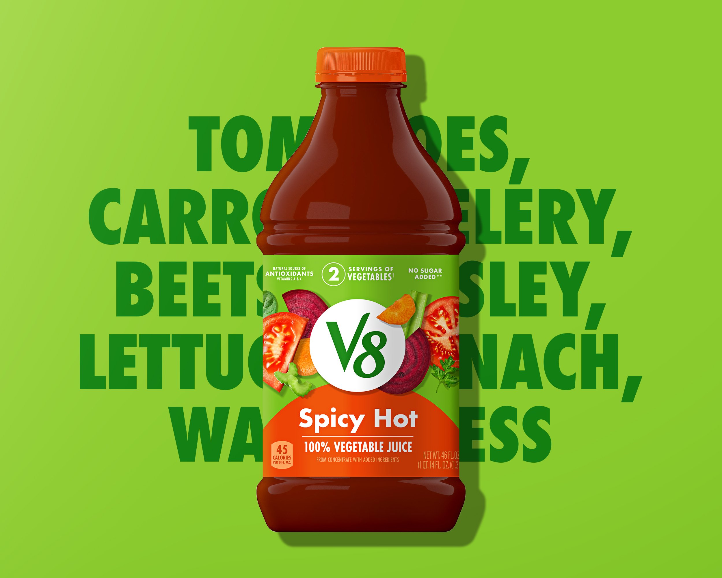
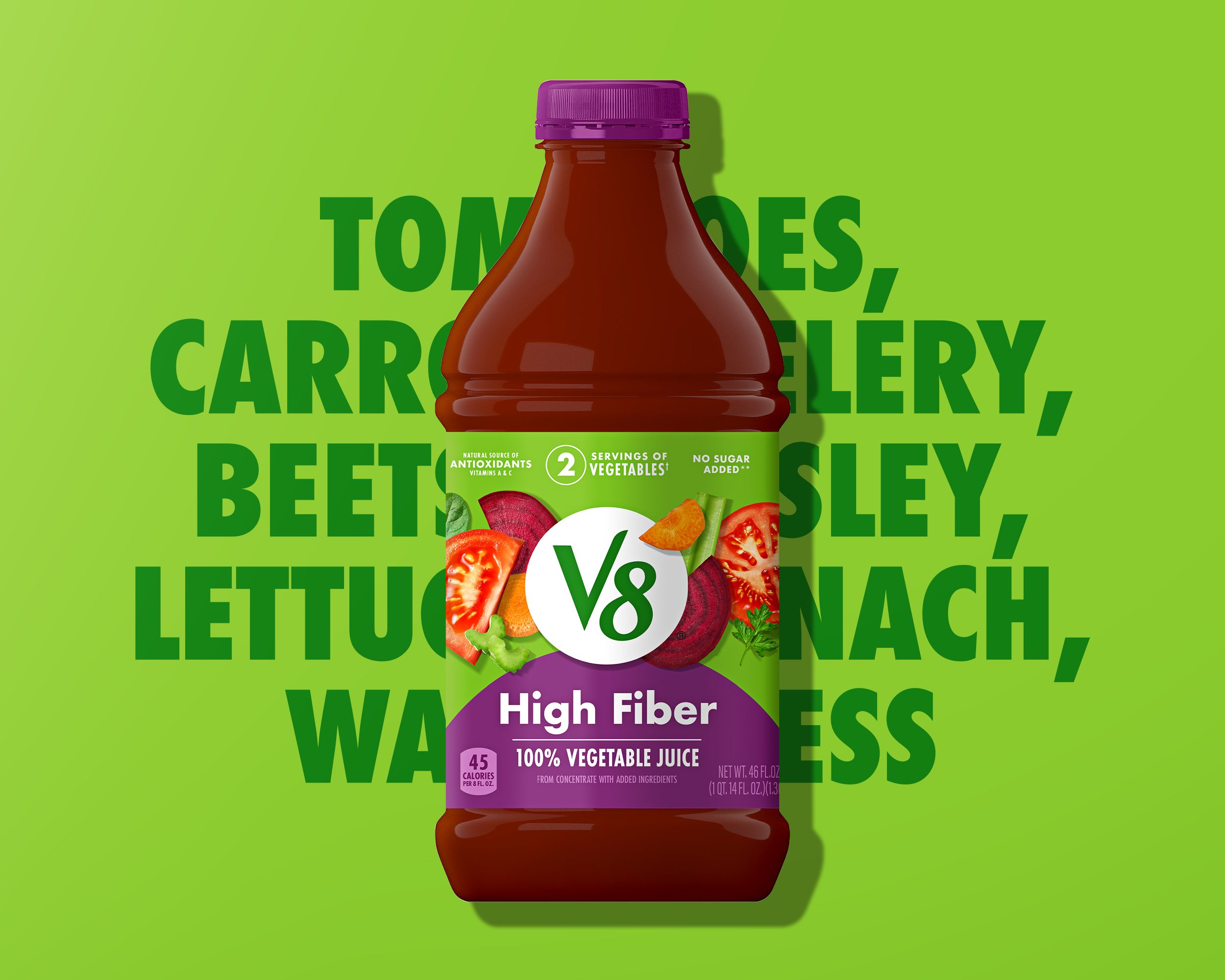
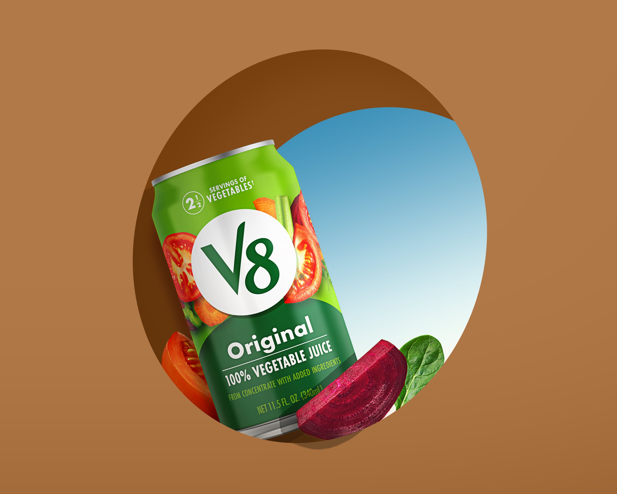
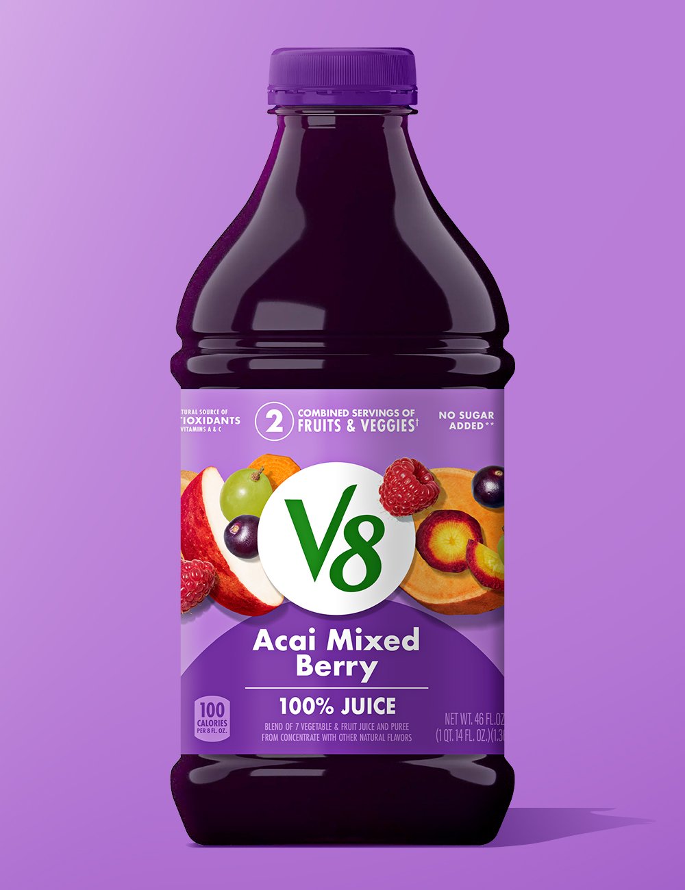
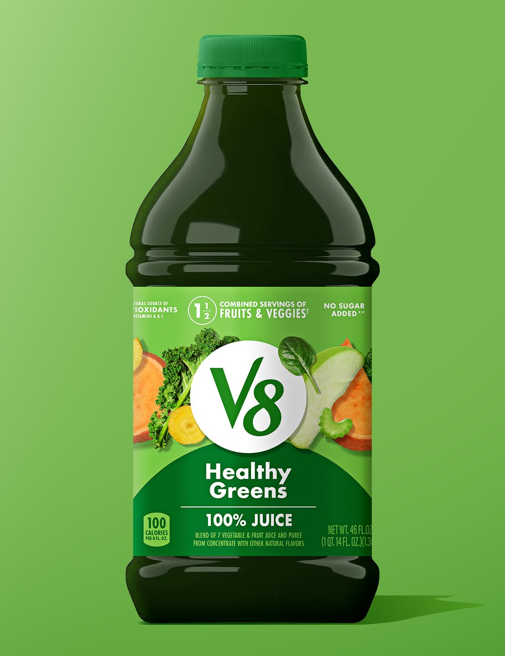
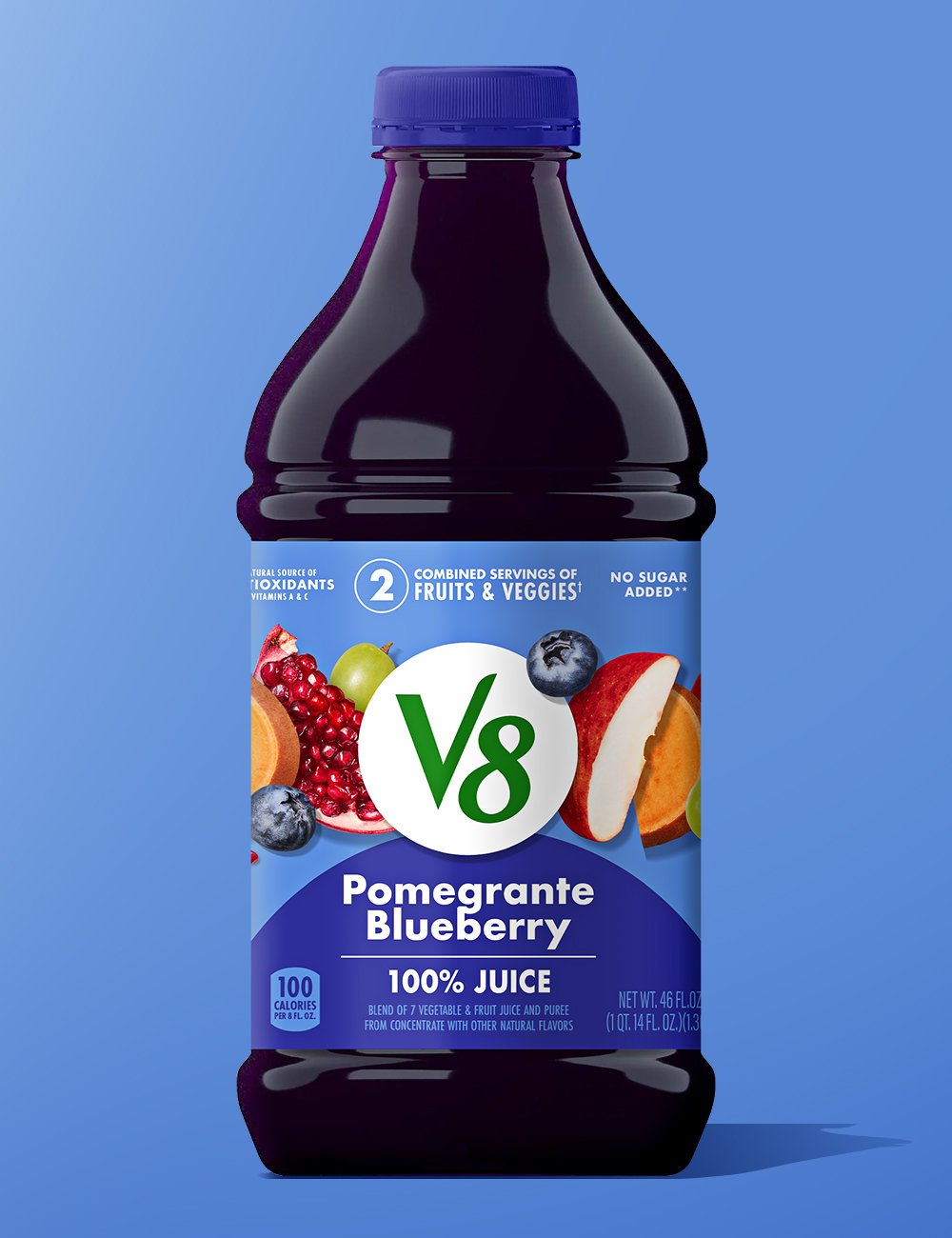
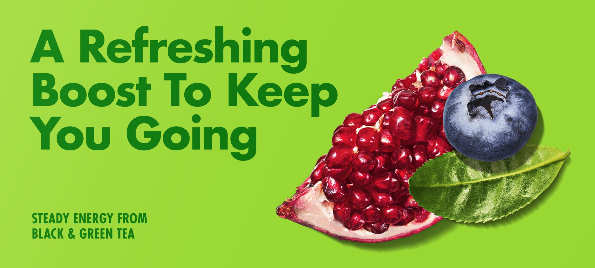
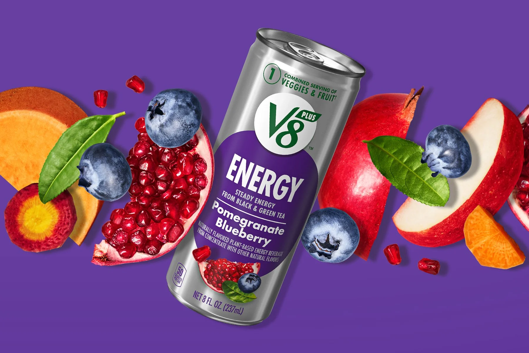
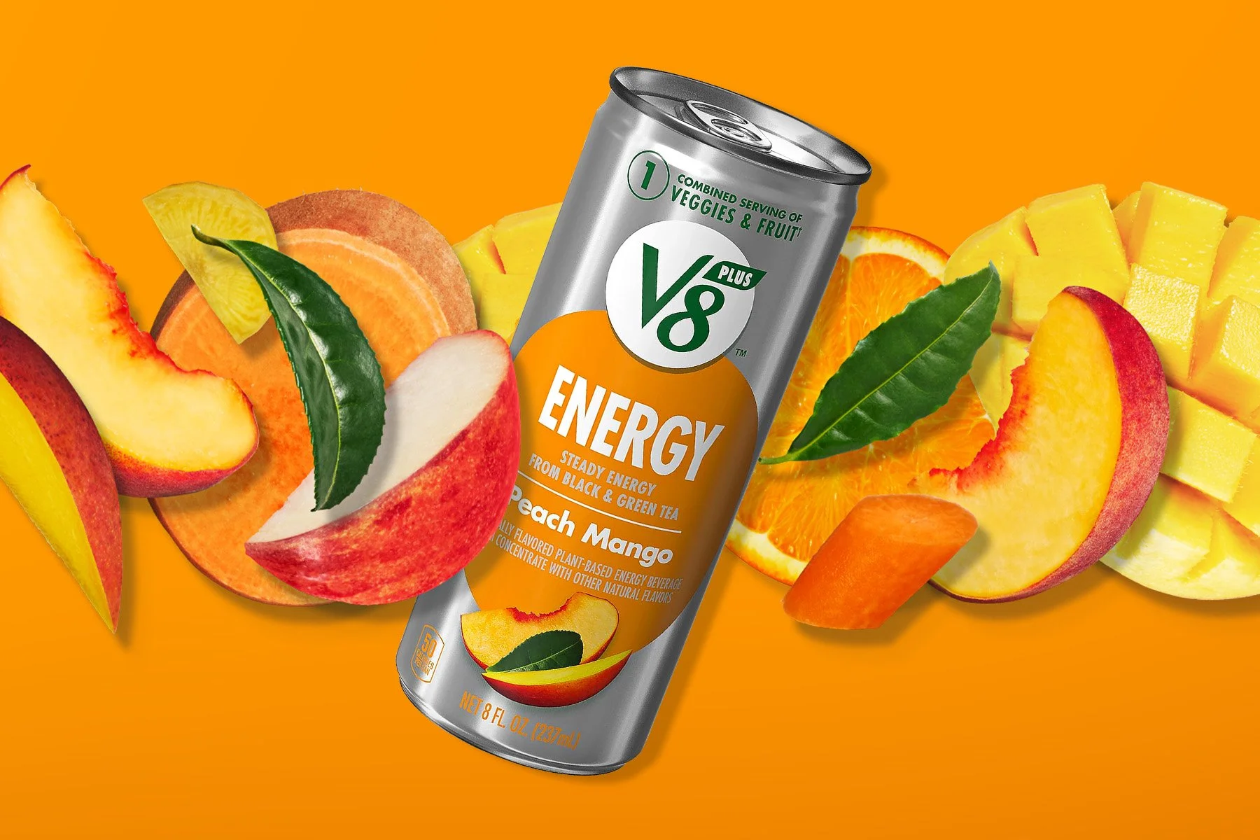
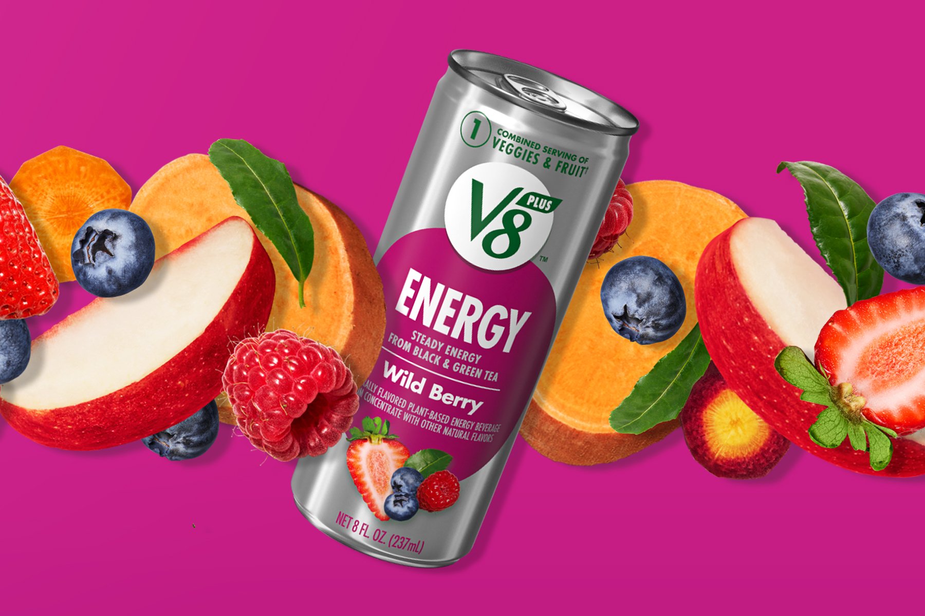
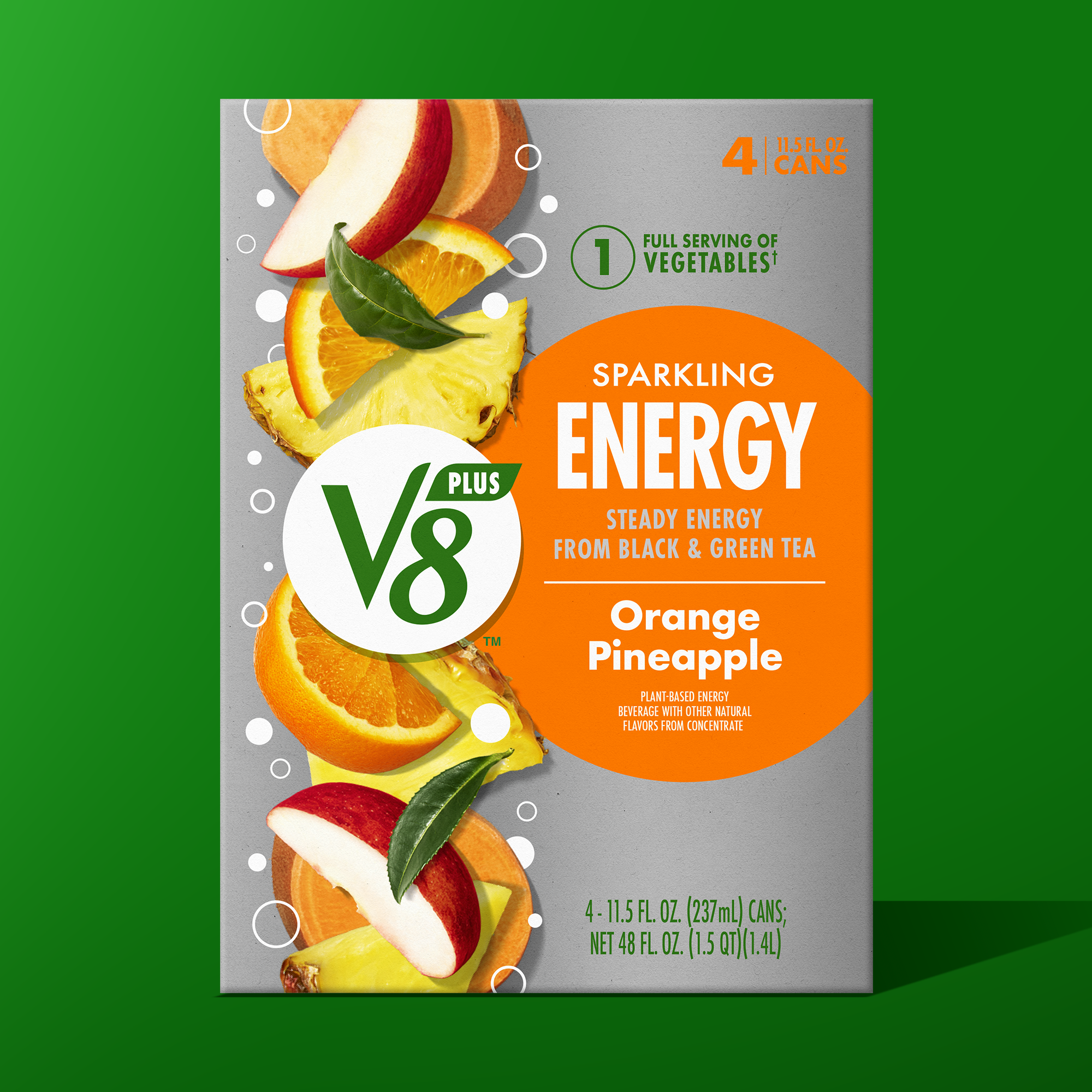
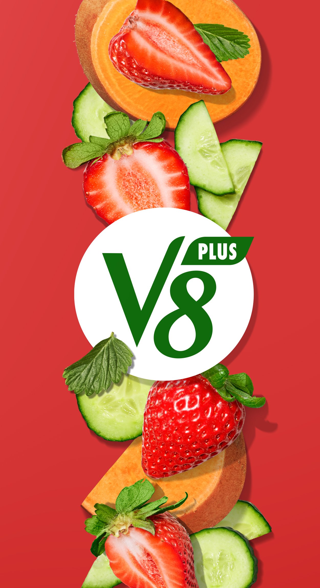
In leveraging the existing design equities that give the brand credibility as the original better-for-you drink, it was essential to consider how to evolve the ingredient imagery and brand emotion. Food photography significantly impacts how consumers perceive taste and function; utilizing dynamic cuts and cascading imagery emanating from the logo reinfused the power of plants as a core tenet of the brand.
The logo was streamlined to align better and sit within the ever-evolving juice category, where consumers desire simplicity and clarity. Stripping out the decorative details and dimensions created a more modern brand expression. One that could step away from the blank letterforms and instead leverage a natural, consistent green tone to convey a sense of natural nourishment.
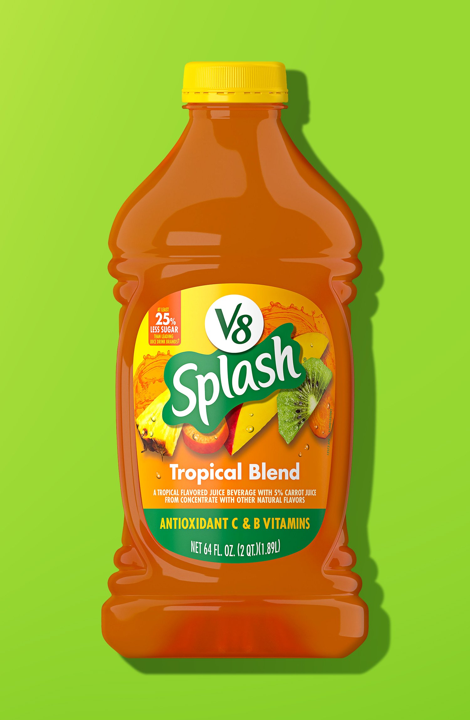
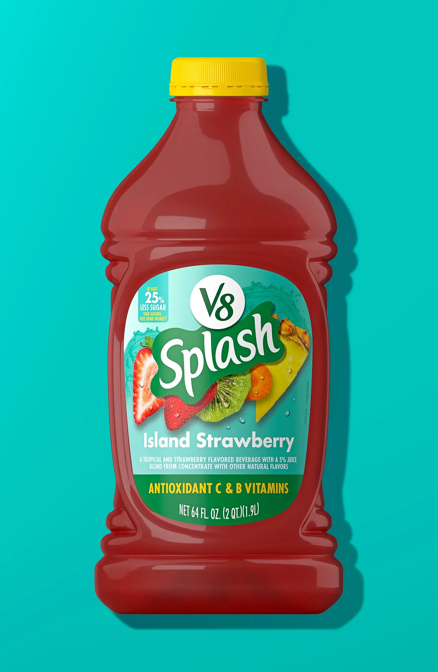
With a vast product portfolio and a diverse range of flavors in each segment, the visual identity was crafted to synchronize core elements across the brand. Recognizability and capability were improved by allowing each product line to be flexible enough to showcase its unique offering while still being tied to the more extensive brand system.
-
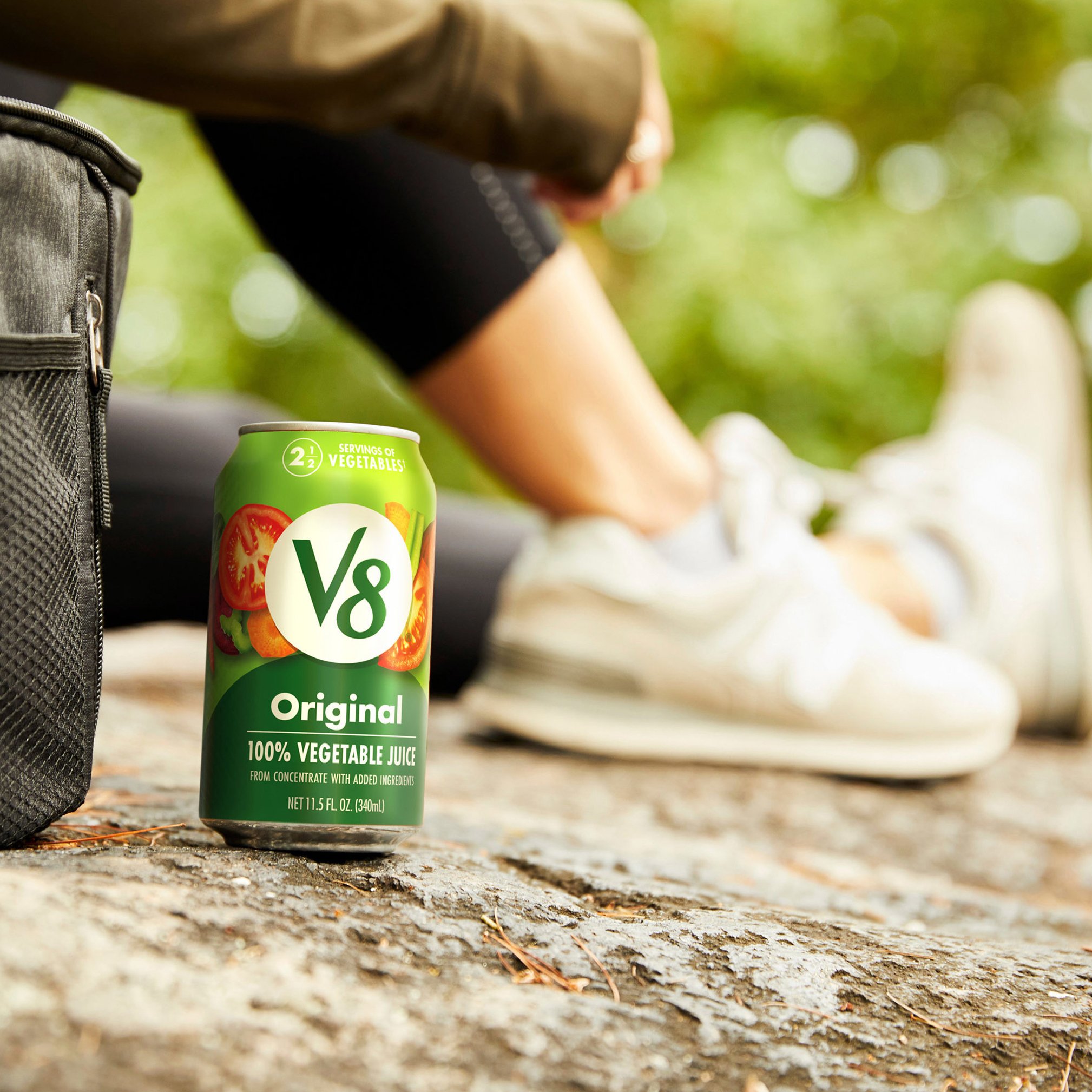
After the successful launch of the new visual identity system, V8 garnered a lot of earned media coverage. To promote the refreshed look, the brand utilized the developed assets in their "Find It In V8" campaign, which boosted product awareness nationwide. V8 attracted new demographics to its core offerings while retaining its brand loyalists.
Innovations such as V8+ Energy saw a significant increase in sales & distribution as younger demographics rallied behind the plant-based energy solution on platforms such as TikTok and Instagram. Building off the success and desirability of V8+ Energy, special/limited edition series was created to reinforce seasonal use cases.
Client: Campbell’s V8 Juice
Agency: Hatch SF
Services: Strategy, Visual Identity, Photography
Nicole Flores - Creative Director
Patrick Smith - Associate Creative Director
Sean Morse - Design Director
Yijing Yan - Graphic Designer