Over Easy
Hatch SF
Shining A Light On That
Feel-Good Morning Vibe
Situation
After a few years on the market as a niche breakfast bar company, Over Easy wanted to broaden its horizons from the direct-to-consumer market and expand into mass retail. They aspired to compete with "Big Breakfast" as a nourishing, delicious, easy option for consumers at any time. The days of being known simply as a "breakfast bar" were ready to be sunsetted.
Task
The primary objective was to evolve the brand's identity to communicate Over Easy's distinct and differentiated nature, setting it up to transition from a niche market to shelves nationwide. To achieve this, the focus would be on highlighting the product's wholesome, uncomplicated ingredients while exuding an all-day taste appeal that outshines its competitors.
Action
Over Easy was repositioned as a delightfully natural snack with a healthy spark of confidence. This easy-going, feel-good infectious force was brought to life by grounding the brand in delivering powered-up nutrition, all-day craveability, and being an upliftingly easy choice for consumers. Discover a newfound confidence and indulge in its realness.
Brand Strategy
Brand & Visual Identity
Brand World Development
Packaging
Illustration
Photography
Dawn to Dusk Delights
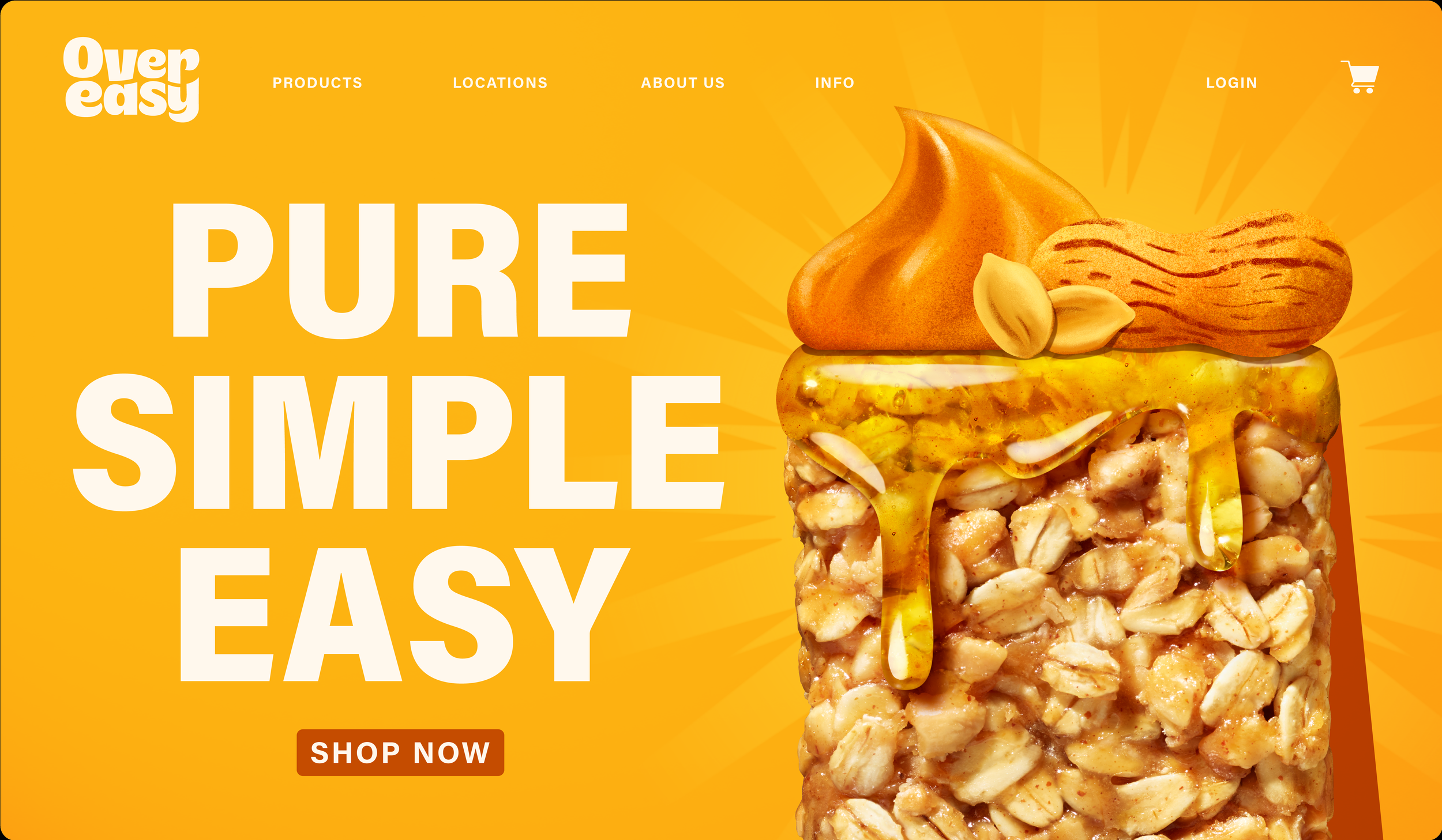
Decadent food photography creates a delightful indulgence that feels oh-so-good that your taste buds will hunger for it all day. From the sensorial honey drip to the soft, warm tones, the oat bars take center stage, elevating the brand's taste appeal. Positioned to stand tall with a powerful monolithic confidence, the imagery is paired with vibrant colors, creating clear flavor segmentation on shelf.
Keepin’ It Natural
Charming ingredient clusters were illustrated for each flavor. The compositions are placed atop the food photography as if on a pedestal, evoking a sense of reverence and admiration. Each cluster is curated with a playful structure; their organic placement creates a naturally inviting realness.
That Feel-Good Ease
The simple yet uplifting language was developed to invite consumers to enjoy more than just their nourishingly easy eats. The aim was also to inspire them to be effortlessly themselves and a feel-good infectious force. The tone of voice balances the functional and emotional benefits, leveraged through bold typography with a stylized fluidity.


